During my time at housing.com in 2018, I was fortunate to work on the consumer mobile app. My primary job was to improve the conversion rate of the mobile app. In this article I will try to discuss some of the initiatives that helped me to increase the conversion rate of the app.
Housing is one of the real estate classifieds portals in India. Housing.com helps people to find real estate properties for buying or renting. The properties are listed on the platform by real estate agents or home owners.
I was a newbie to mobile apps when I started working on the app. Frankly speaking, I was little scared to take up the challenge as I initially felt that features on the mobile app are on par with the mobile website and hence their won’t be much scope for improvement. Hardly did I know that couldn’t be more wrong, only time will tell. I also had a few constraints. At that time the traffic on the mobile app lagged behind the mobile web and the desktop. I couldn’t implement any new features which required back end APIs as the back end team was occupied with the web priorities.
Through various initiatives, I was fortunate to improve the user conversion rates of the mobile app by more than 60%.
Let me first define the conversion rate.
User conversion in this context refers to the percentage of users who submit a lead by verifying their phone number on a property they like, out of the total number of users who visit the mobile app.
Below are some of the initiatives that helped me improve the conversion rates. All the changes mentioned below went live after A/B testing experiments. I have listed down only those experiments which were successful.
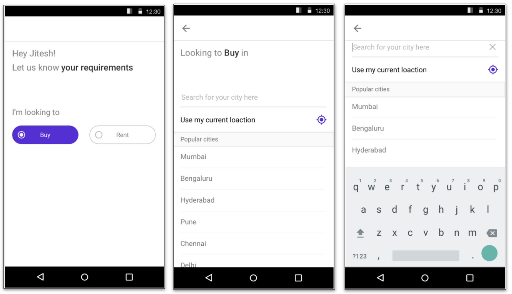
The Onboarding Journey
Then
When a user opens the housing app for the first time after installation, they were taken to a city selection screen. Once they search and select city, they were taken to a Homepage.
This homepage contained a search bar, where the user had to add the name of the locality they are looking for and click on search button. This home page also had a list of promoted properties and categories.
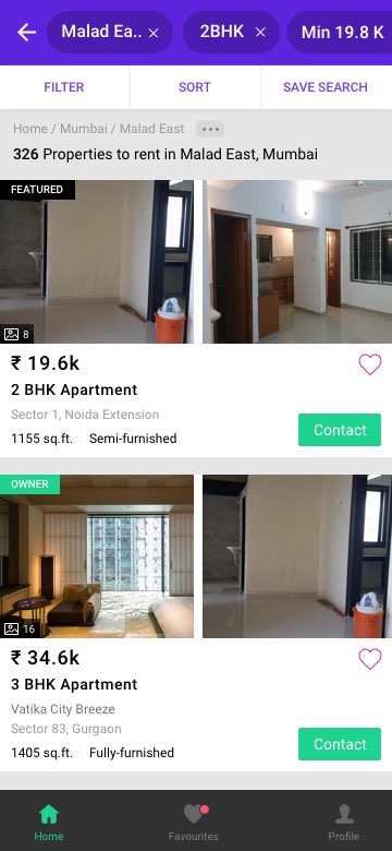
Clicking on search button will take them to a search listings page. This page contained the list of properties available in the locality. The list of properties where sorted in the order of popularity ranking.
Since these are new users, we had no click stream data, there was nearly no personlisation possible in this ranked list.
Now
We started with identifying the parameters that every home seeker will have in mind while they start looking for a property. Through user interviews, session recording and the analysis of the property filter’s usage data, we came to the conclusion that even if a user hasn’t finalized on a locality, they will still have some basic criteria on the budget range and the BHK type(Bedroom Hall Kitchen).
This is broadly true for both Rent and Buy cases. For buy cases there is also a knowledge building process which I will talk about in a separate blog post.
Hence we decided to make budget range and the BHK type capture part of the first time visitor’s user journey and called it ‘Basic Profiling’. Once they click on search after selecting these details, they were taken to a listings page with more refined list of properties as per their requirements.
We released this as experiment. Initially we were slightly concerned about the drop offs this new user journey can cause due to introduction of the additional steps. This worry as unnecessary as the improvement in the conversion rate far out weighed its impact on the drop offs in comparison with the control group. We ran the experiment for a few weeks and once we established that the results were statistically significant we rolled this out to the rest of user set.
|

|
| Mockup of the new onboarding journey |
Additional enhancement
We wanted to experiment with another hypothesis. Since users put in high efforts to download and install the app on their mobile device, will they be okay to signup with their phone number when they open the app for the first time. This way we could avoid verifying their phone numbers when they drop a lead on a property. For this hypothesis, we ran an experiment with two variants.
- Mandatory signup with OTP verification
- Prominent signup screen with an option to skip this step.
To our surprise Option 1 turned out to be the winner. Still we decided to go ahead with Option 2.
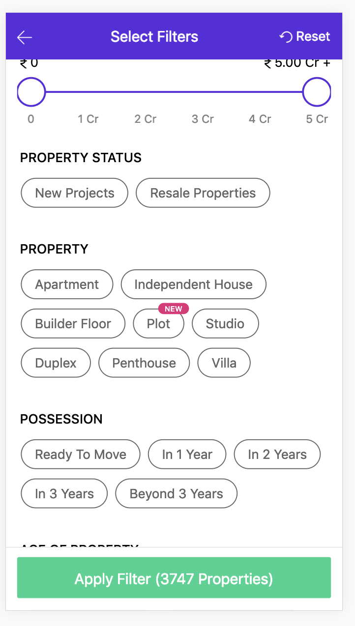
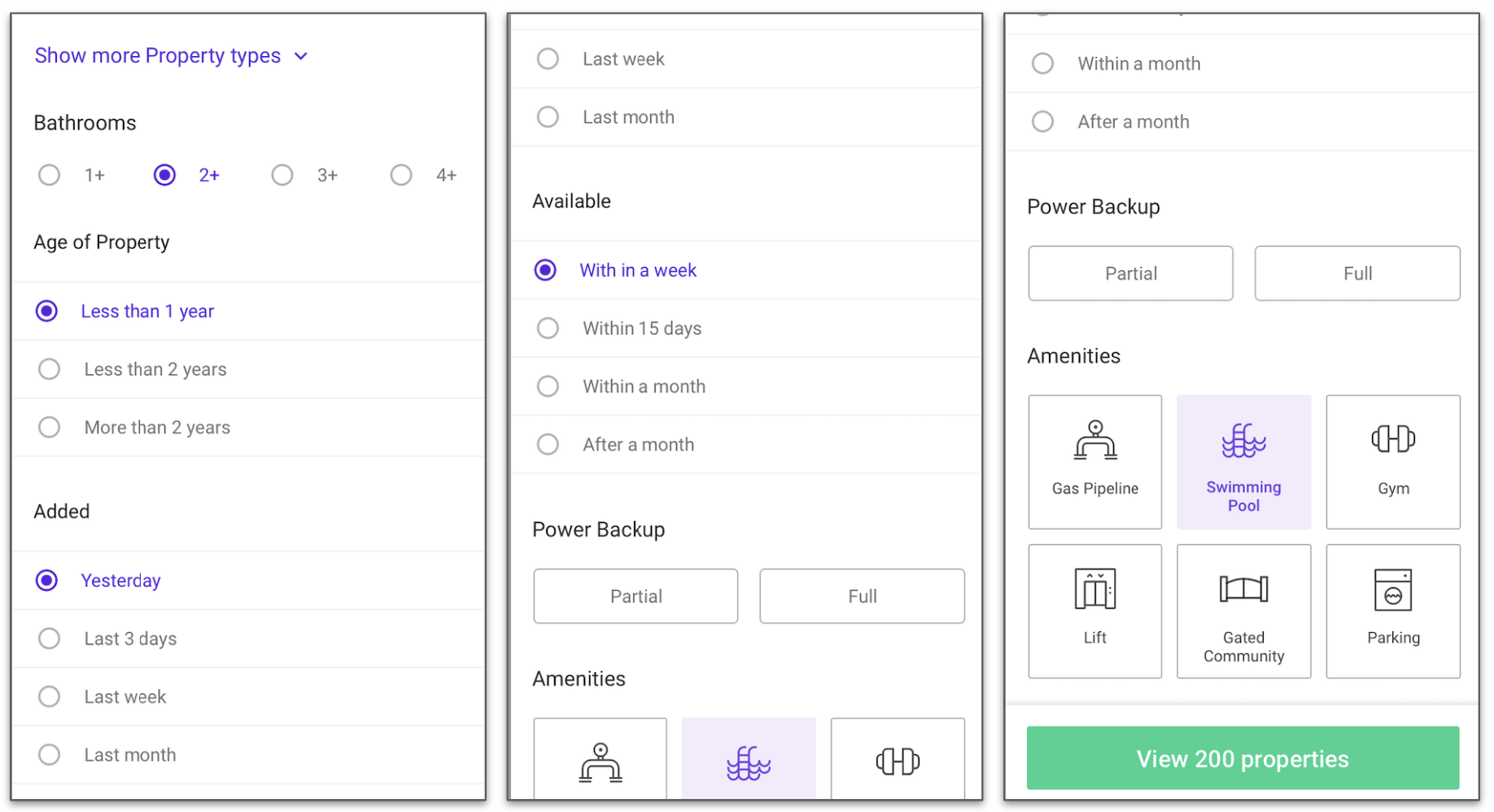
Filter revamp
When we analyzed the filter usage data, we found out that only ~60% of user applied atleast one filter during their apps lifetime. We also happened to compare the conversion rates of users who applied filters vs those who didn’t apply any filters. The difference in conversion rate was more than 50%. This would mean that if we can make additional 15%users to apply filters, this would give us a jump in overall conversion rates atleast by 5%.
Thus we set ourselves a goal to revisit the design of the filters and its user journey to improve the usage of filters. The changes primarily included the improvements in accessibility, usability, Information architecture and information overload. By analyzing usage of each filter we came to conclusion that not every filter needs equal priority, while some of them have high usage other are rarely used or used only by power users. Hence we grouped the filters under 3 categories, Basic filters, Most used filters and advanced filters. Basic filter included only the budget range and BHK preferences and we made it part of the profiling as described in the ‘Onboarding journey’ changes. We also brought it out of the filters section and gave it more prominence in the search listings page. The rest of the most used filters where sorted in the order of usages. The ones with less usages where moved to the ‘Advanced filters’ sections.
We made filters more accessible to the users. This is covered in detailed in the later part this article. We also did several usability improvements on the filters page.
| Filters Page Then | Budget Filter Now |
|
|
| Filters page now |
|
|
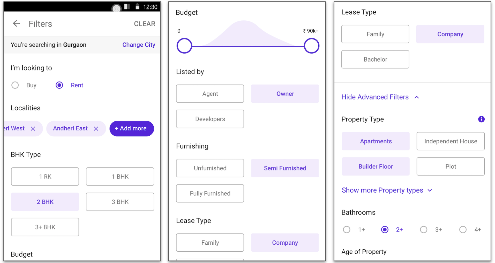
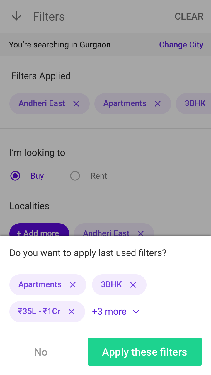
Filter history
A mentioned earlier, the primary search parameter was a locality, lets say a user changes the locality, it is highly likely that the rest of the search parameters will remain the same. With this hypothesis we made it easier for users to apply previously applied filters via filter history recommendations.
|
| Last used filters |
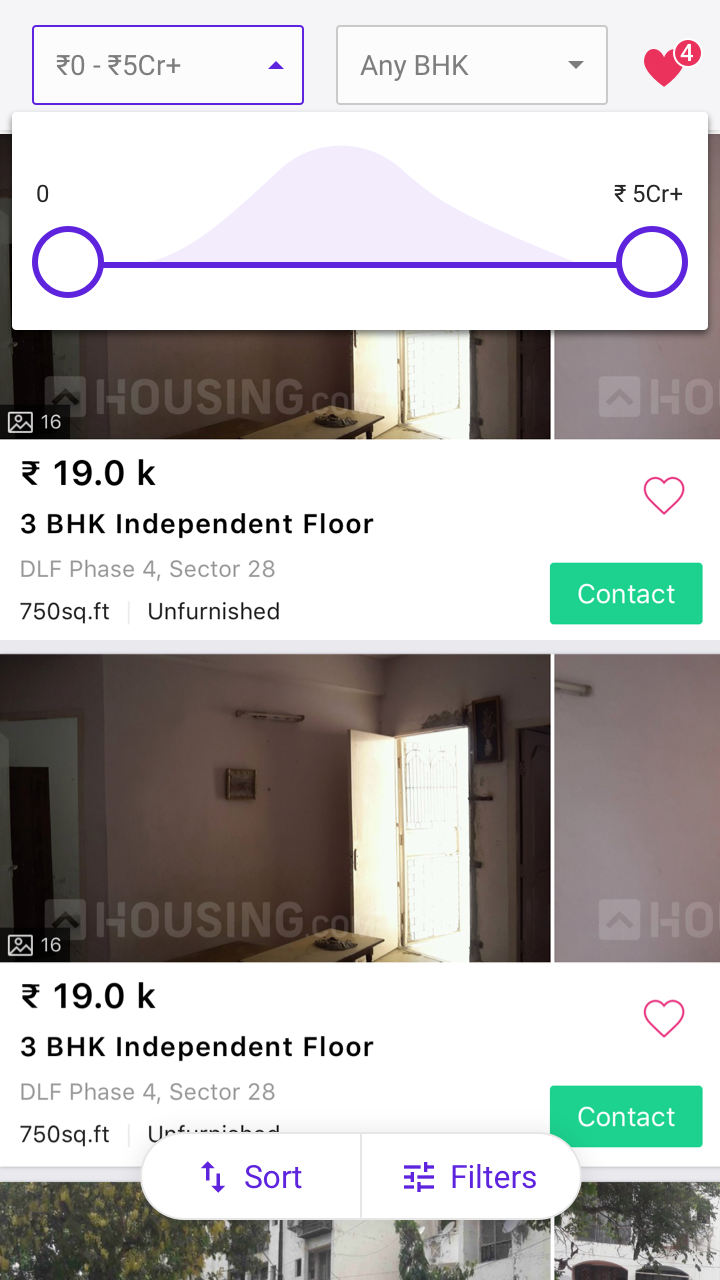
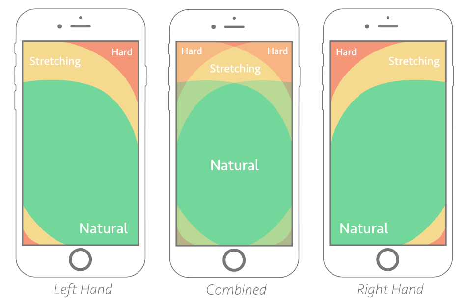
Accessibility
We re-looked at the entire app from the lens of accessibility for the thumb. We observed that on the search listings page the accessibility of the filters and the locality search was hard. Also the ‘Menu’ options at the bottom of the page which are easily accessible were not at all relevant in the context.
|
| Accessibility of the thumb |
We made filters more accessible by moving it to the bottom section of the screen. This improved the filters usages and caused improvement in the conversion rates.
| Then | Now |
|
|
Information architecture
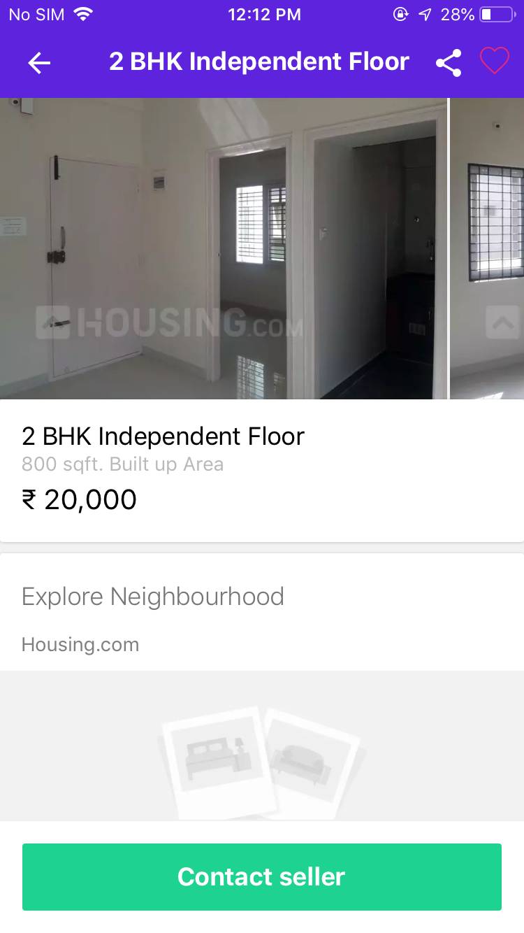
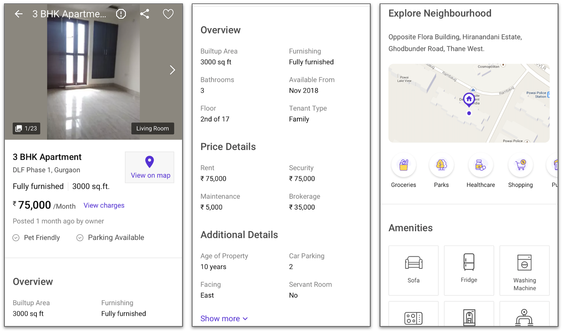
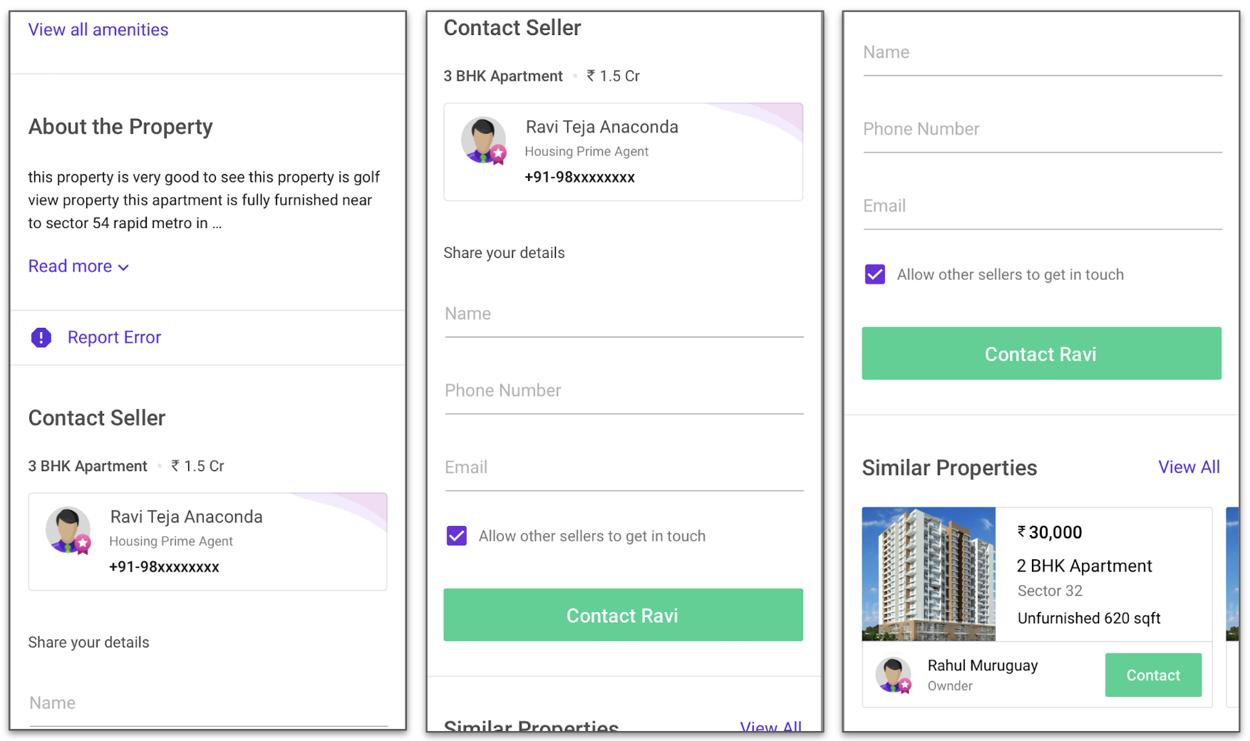
We ran a survey among the users to understand all the things mattered to them while looking for a property. Housing.com used to have masked phone numbers for the home owners and agents. When a user calls the the agents or the home owners via masked phone numbers, the call gets recorded and these recording are available for access for a few months. From these sources, we realized that certain information which we deemed as low priority were important to the users and in many cases they were unable to find such information on the properties.
- For Rental properties
- Split up of the additional costs such as Maintenance fee, Brokerage etc.
- Whether Pets are allowed
- Available for bachelors
- 24Hr Water supply & electricity backup
- Parking Space
- For Buy Properties
- Additional Charges
- Accessibility to certain landmarks
- Amenities
- Vastu
- Parking Space
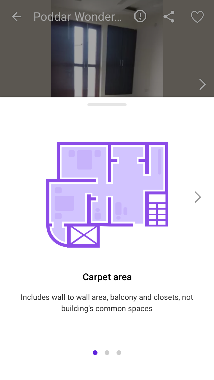
We redesigned Property details page to give higher priority to the important information. We also focused on the readability of the information. Wherever we used more technical terms we gave additional context. We also tried accommodating all the important details “above-the-fold” or “initial viewport.”
| Rental Property Page Then | Example Additional Context |
|
|
| Rental Property Page Now |
|
|
Returning user Home page
We started giving a differentiated experience for the returning users. One such change was giving more prominence to the continue search button over the new search box.
| Then | Now |
|
|